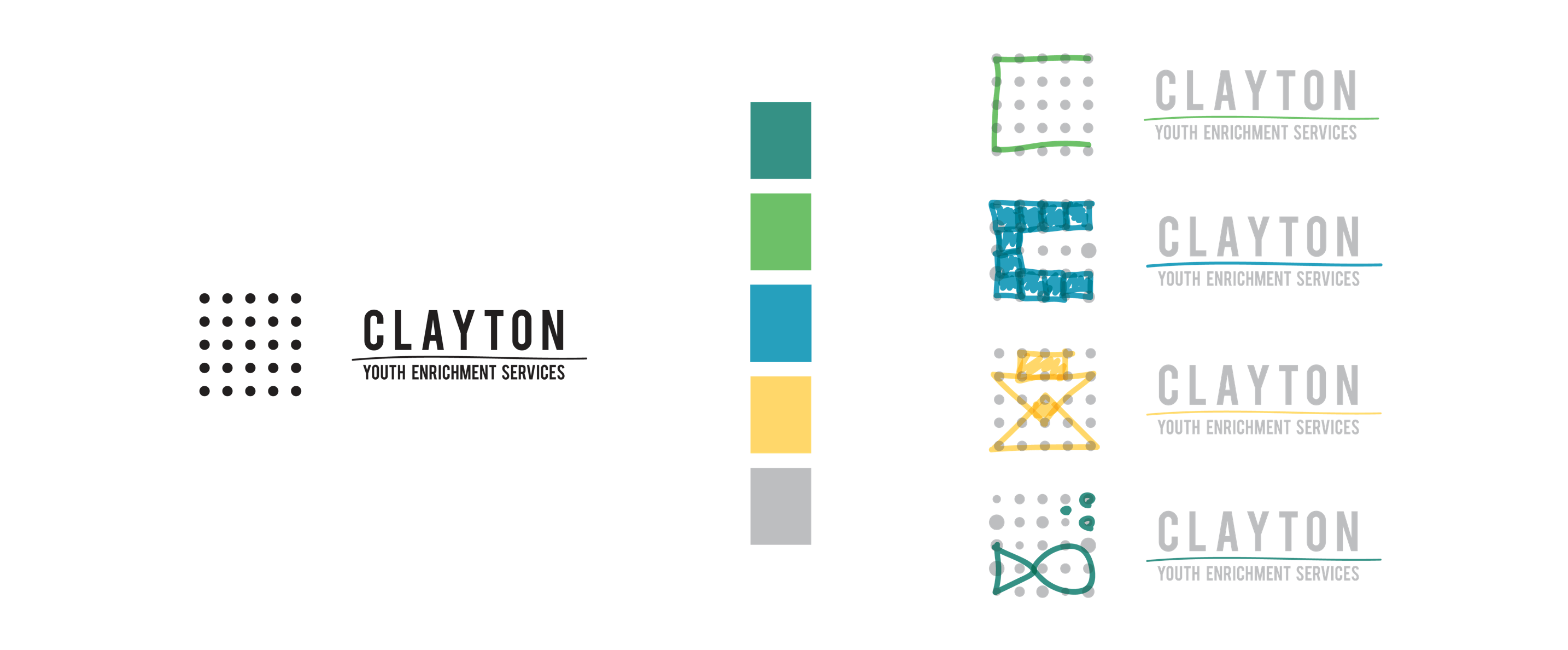
This logo lends its self to the motion of actively reaching out and helping community members. Clayton is taking the active approach to provide childred after hours enriching activites.
This concept brings the logo to life by providing a framework for children and the brand to utilize the logo for any application or express the creative nature of the enrichment program.
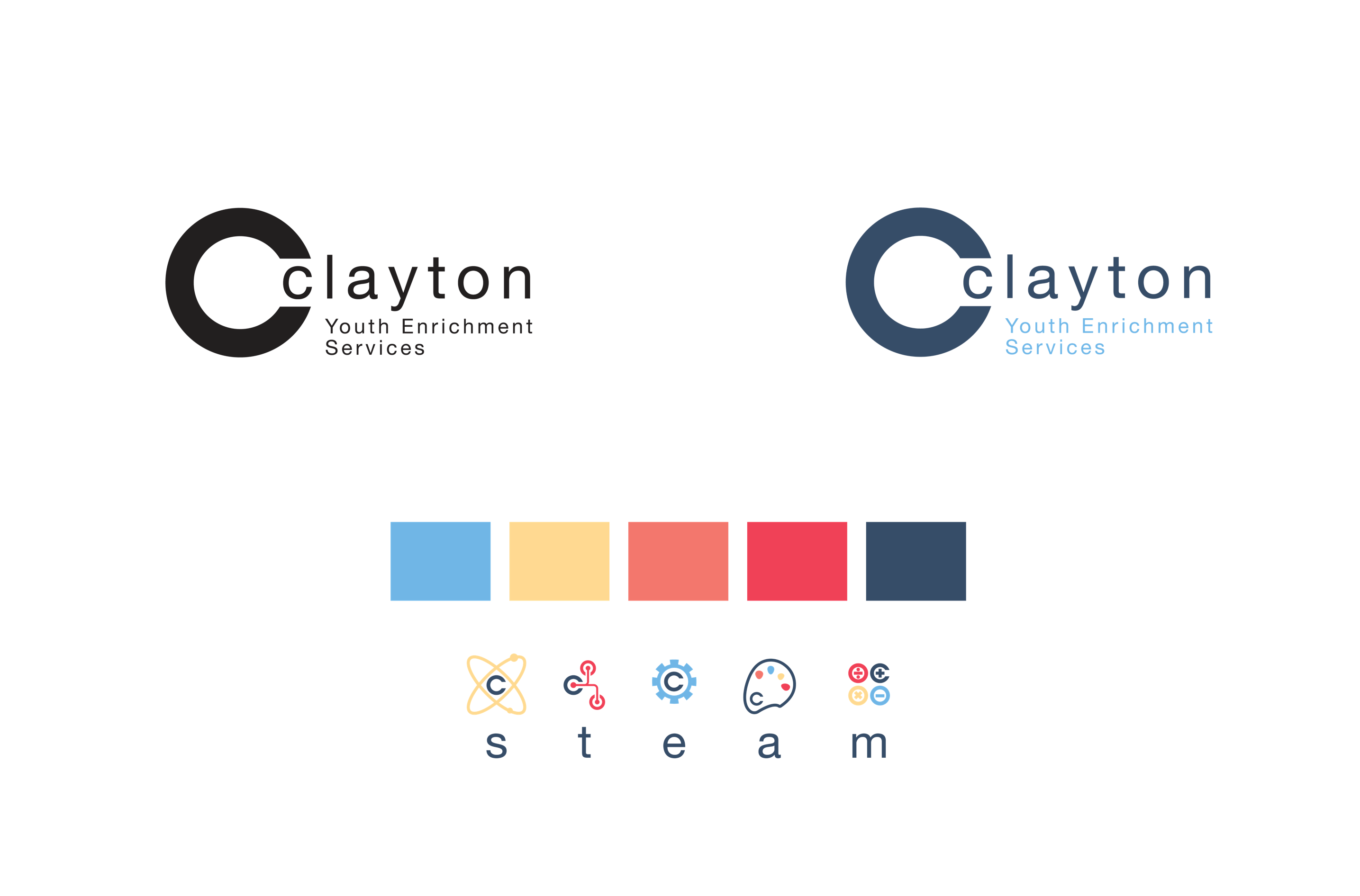
Clayton YES! provides a wide array of services for their memebers. This logo conveys the rounded activities with the C as a mark. Accompanying the mark is a set of icons that relate back to one of their core acronyms ‘STEAM’.
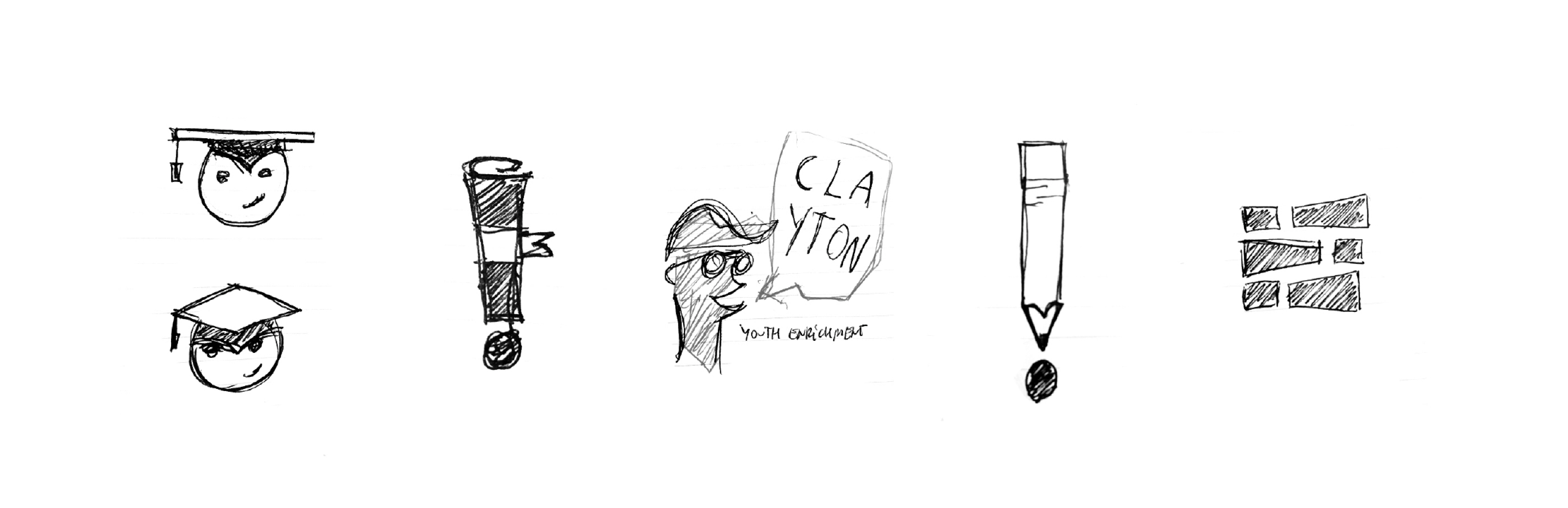
Kids love to be active and explore. This logo combines the active nature in a playful fashion while learning which is attributed to soup.
Kids love to be active and explore. This logo combines the active nature in a playful fashion while learning which is attributed to soup.